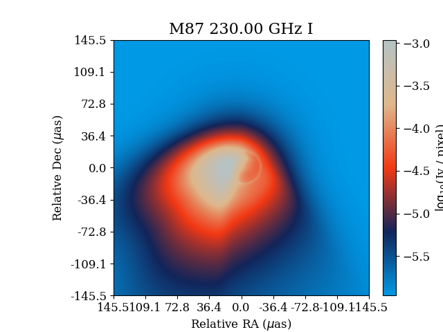
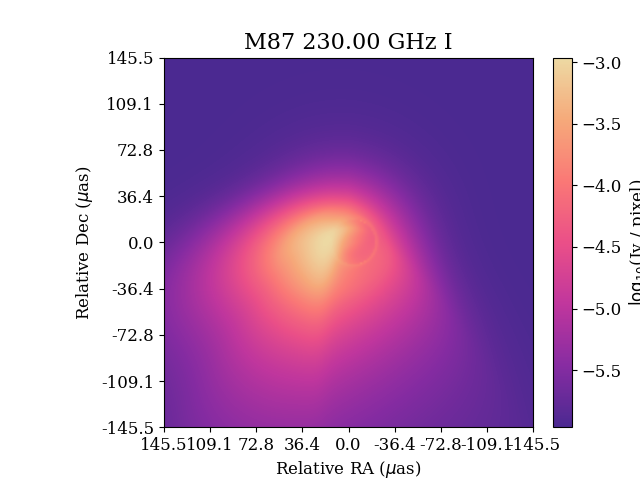
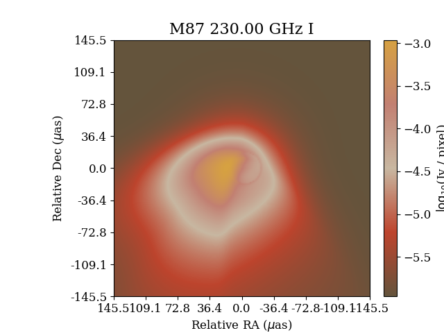
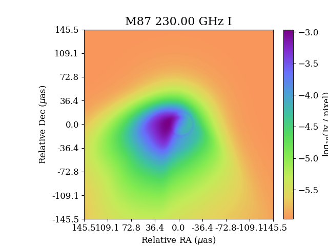
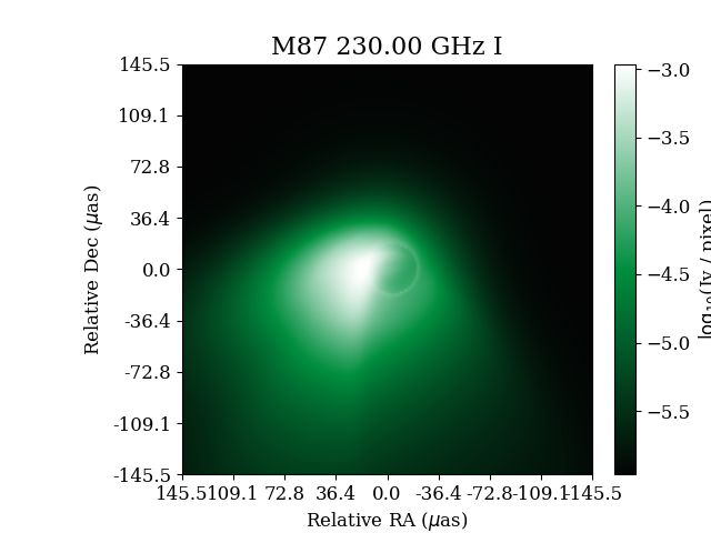
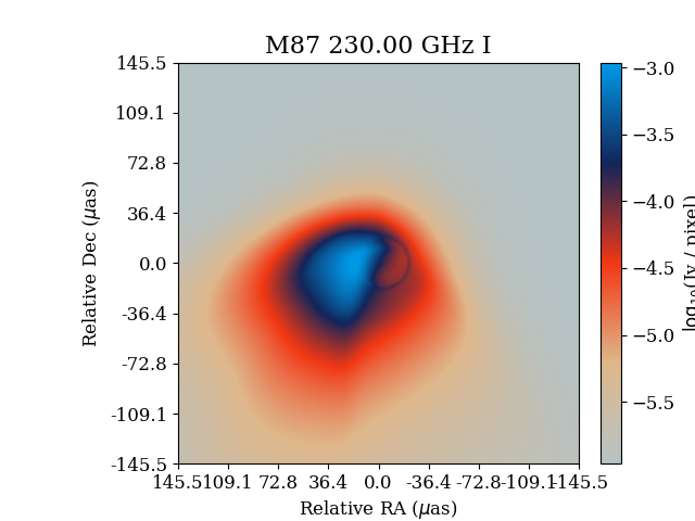
A few images generated with the source code from the EHT black hole imaging project. Color maps were taken from the Palettable Python package. I have made some minor modifications to the code, which I felt produced visually more appealing results and allowed me to change some additional parameters of the image display.
There were a few news articles circulating about this not too long ago. I found the project very interesting and had played around with the code as soon as it had been released. The pictures that came out of it were sitting on my hard disk, collecting dust, so I thought I might give it a try and share them here. Most of this is not my creation and I hope it doesn’t seem to derivative. I just liked the variations of the images that I ended up with. The original authors have by far done the bulk work and I have only made very minor tweaks, such as specification of a custom color map, brightness scaling, interpolation, etc.
Here is some important feedback I have received on the images:
The colormaps we use are certainly not arbitrary, and we’re actually not free to use whatever colormaps are technically available. The choice is motivated by the data and what we want to highlight.
You can already see for yourself that not all maps are equal simply because there are non-existent features being highlighted, especially by the plot in the top right. It seems as though there’s some kind of strange ring structure in the green. That structure does not exist and is a trick of the colormap, hence that colormap would not be appropriate for the data.
The overall issue is one of “uniform perception”, or a lack of it. To put it simply, if you convert each colormap into greyscale (e.g. like this, check out the “Miscellaneous colormaps”), you see that some maps are noticeably brighter/darker in certain areas. In the case of the “jet” colormap, which used to be the default, your eye will be drawn to the cyan and yellow parts on any plot and so those regions might look like separate, notable features when it’s actually a completely smooth transition with no feature. “Perceptually uniform sequential colormaps” don’t have this problem, hence viridis is now the matplotlib default and jet ought to be avoided.
You can read a bit more about it here and in this paper.
Therefor, these images should be taken for the visual appeal only. For scientific data in formal settings, these are not good color maps to use. The viridis color map below might be the only one that would be acceptable, being generally recognized to be a perceptually uniform color map.
M87 afmhot

SagrA twilight_shifted

SagrA afmhot

SagrA inferno

agSunset_7
Aquatic3_5_r
Cube1_10_r
GrandBudapest5_5

LinearL_3
Viridis_18

Zissou_5_r
Zissou_5